


Mastering Metric Switching in Power BI Dashboards Using Parameters

In today's data-driven world, organizations often track numerous metrics and KPIs to monitor performance. However, visualizing every single metric in separate dashboards can be overwhelming and inefficient, leading to multiple reports with redundant formats. This pain point can be addressed effectively using Power BI’s parameter feature, which allows for dynamic metric switching within a single dashboard. This article will guide you through the steps to create a Power BI dashboard that enables users to switch between different metrics seamlessly.
Why Metric Switching is Important
Metric switching enhances the interactivity and usability of dashboards. It allows users to view different perspectives of the same data without needing multiple dashboards. This not only saves time but also helps in making more informed decisions by providing a holistic view of the data.
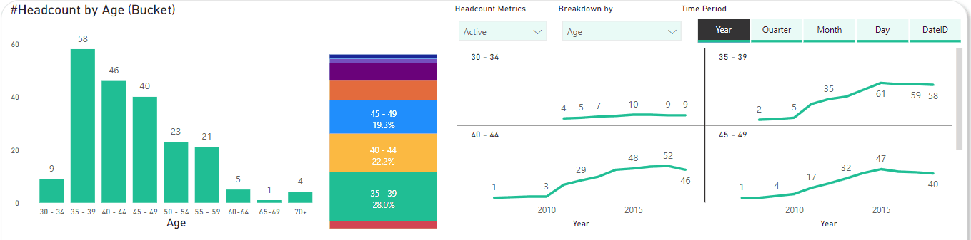
In the end, you will achieve something like this.
Let’s start!
Example Dataset and Context
As data analysts for the Human Resources department, our first dashboard focuses on an essential metric: headcounts. Headcounts can be calculated in various ways and broken down by multiple dimensions, such as department, age, and recruitment source... We aim to create a comprehensive dashboard where users can switch between different headcount metrics and view detailed breakdowns, all within a single, interactive Power BI dashboard.
Step 1: Set Up Your Measures and Dimensions
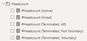
Before diving into creating parameters, ensure your dataset is ready with measures. In this example I have 5 different metrics:
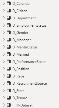
We will have bunch of different dimensions, I highly recommend to set-up a proper Data Model between Fact and Dimension tables. It helps structuring the data flow and make it harder to miss any dimensions.
I have another articles that explain on how I calculate these metrics. I leave the link in the comment.
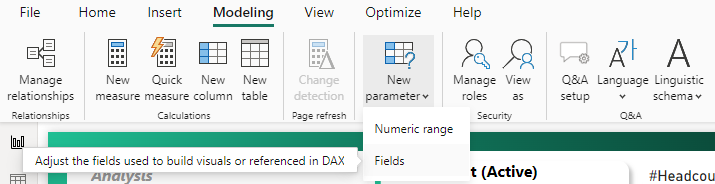
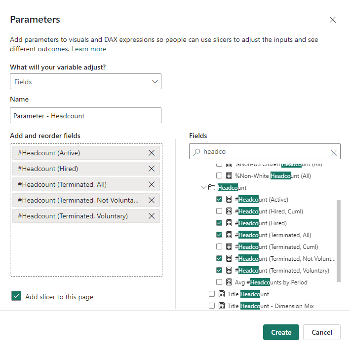
Step 2: Create a Parameter
Navigate to the “Modeling” tab in Power BI.
Select “New Parameter.” In this example, we mostly use “Fields” option.

Create a Metric Selection Table.
I highly recommend have a consistent naming format, it should start with “Parameter” or any text that help you distinguish it from other tables.

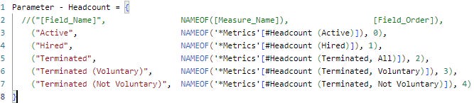
(Optional) Edit fields name and order.
You actually can do it in previous step, but be noticed, once you click “Create”, there is no way you can go back to this window. You can only edit field name, change field order or add/remove field via DAX. Luckily, it is super easy in DAX.


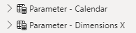
Repeat this step with other dimensions you wish. In this example, I create two more parameters as below.
Step 3: Visualize the Selected Metric
I want to visualize #Headcount by Age. So I place parameters Dimensions in X-axis and Headcount in Y-axis.
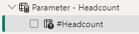
Next you create a slicer for each dimensions (it would automatically created after Step 2, unless you uncheck “Add slicer to this page” checkbox).
Step 4: Test Your Dashboard
Interact with the parameter slicer to switch between different headcount metrics. Ensure that all visuals update correctly and provide accurate information based on the selected metric.
Dynamic Chart Title
It is possible to let the title change according to selected metrics and dimension.
Step 1: Create a measure that reflect the change you want to see.
I leave 2 options for you to choose. Be noted, only one metric is selected at a time in order to make second option work.
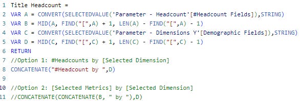
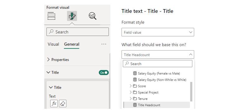
Step 2: Change chart title to the measure in step 1
Click the chart → Format your visual → General → Title → Conditional Formatting (fx)
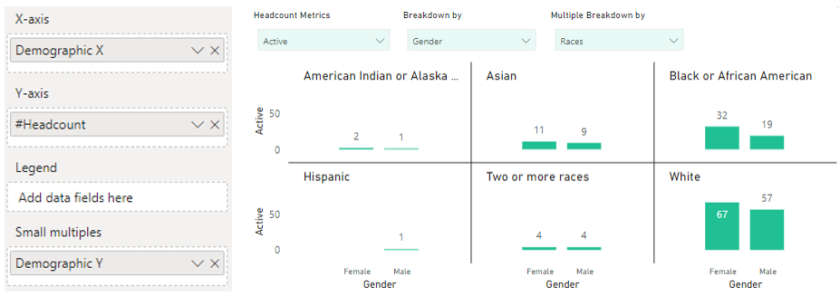
Another Tips
I found this feature is extremely helpful in case you want to mix different dimensions in data exploration process. If you want to do it in traditional ways, only Gods know how many charts should be created due to the number of dimensions combination.
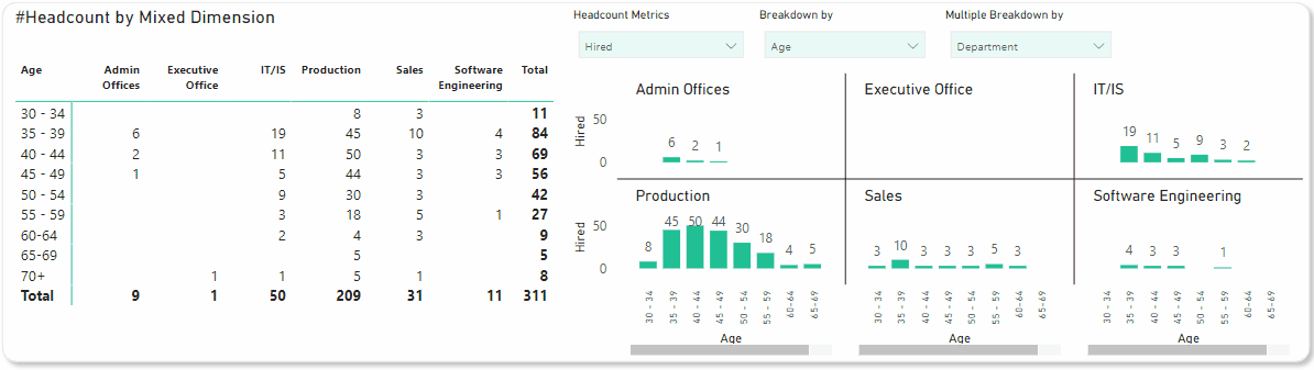
You just need to create another Dimensions Parameter and put it in appropriate fields in visualization panel. Example as below:
By following these steps, you can create a dynamic and interactive Power BI dashboard that allows users to switch between different headcount metrics with ease. This functionality not only improves the user experience but also provides deeper insights into the data.
This is just an application of the parameter feature in Power BI which is called Field Parameter. There are other 2 applications which you can find in my blog.
Subscribe to my Substack for more tips and tricks to master Power BI. Stay tuned and see you soon!