How to use Python in Power BI
With example of Histogram Building

Step 1: Install Python
Follow this link and download python: https://www.python.org/downloads/
Run install file
Remember to check the box that says "Add Python to PATH"
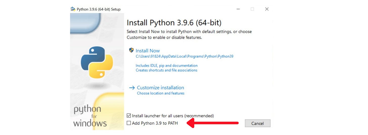
Save the installation path before hitting “Install now”. Normally, the installation path is
C:\Users\[UserName]\AppData\Local\Microsoft\WindowsApps\python3If you can not find the path, open Command Prompt and type:
where python

Step 2: Install necessary Python packages
It depends on your analysis requirements, here are most popular libraries: pandas, numpy, matplotlib, seaborn, scikit-learn, statsmodels, datetime…
Open Command Prompt and type:
pip install [libraries]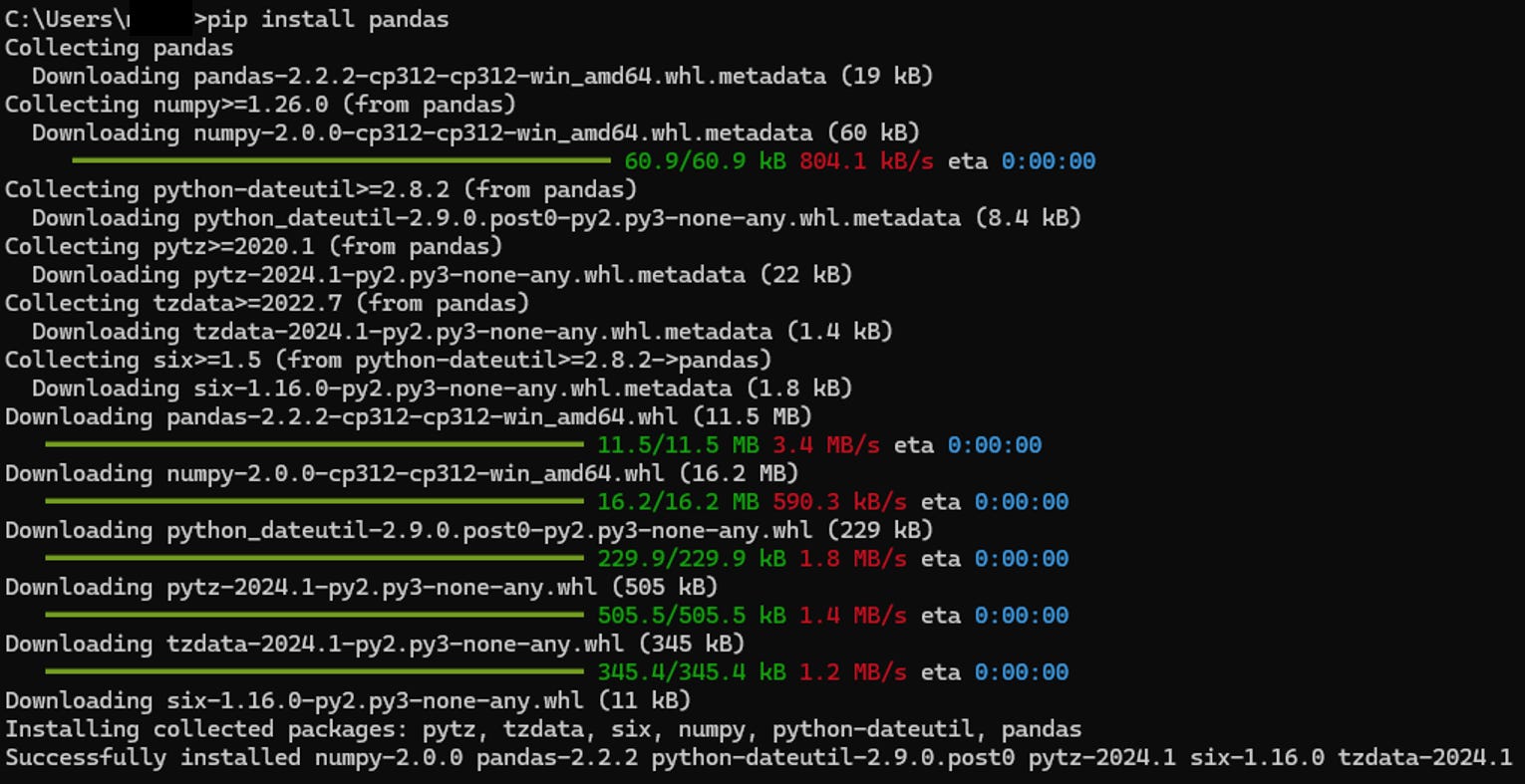
Step 3: Enable Python Scripting in Power BI
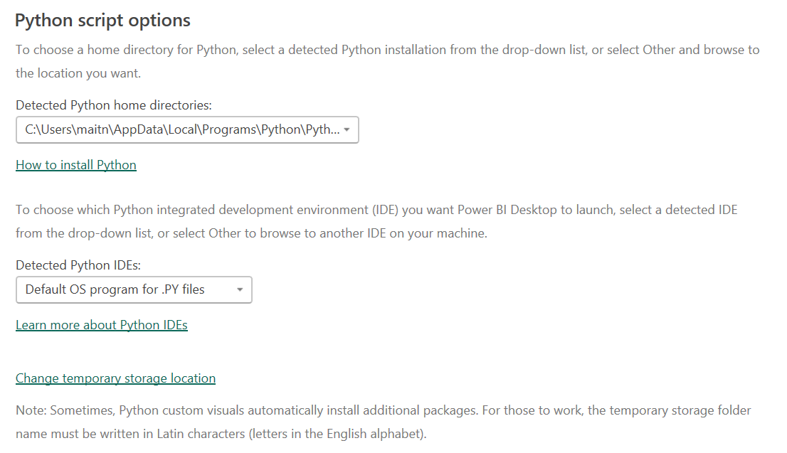
Go to File > Options and Settings > Options > Python Scripting
Fill in the python path, it might be automatically fill in for you

Let’s test the feature with below use case
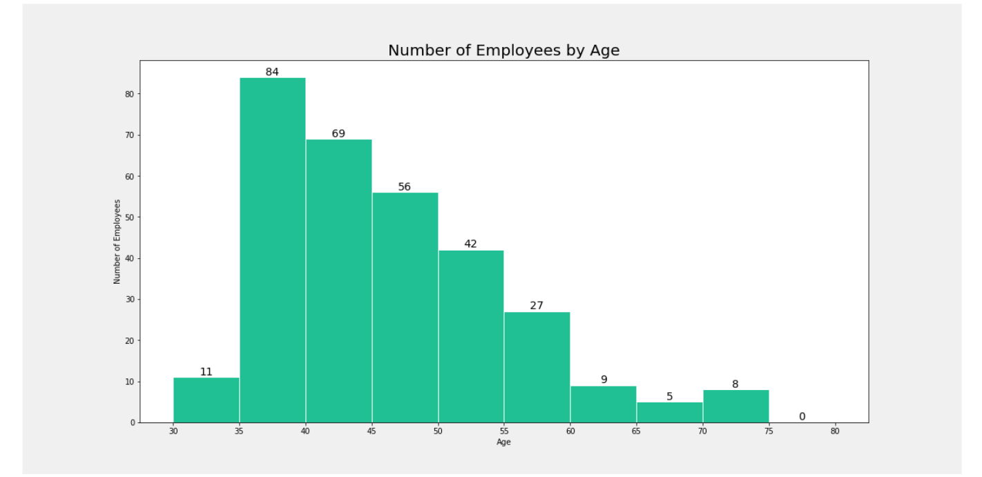
Create Histogram chart by Python in Power BI
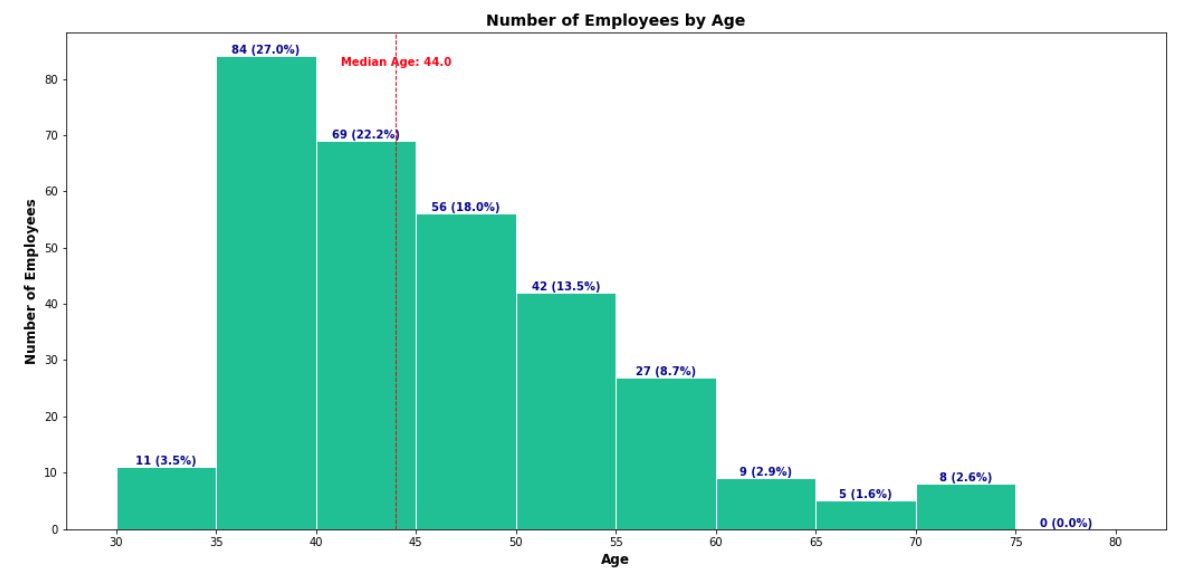
In this example, we want to create histogram of #Employees by Ages.
Step 1: Select Python visual, select data fields from table
Make sure the data field is not calculated (don’t summarize).
The screen display is as below.
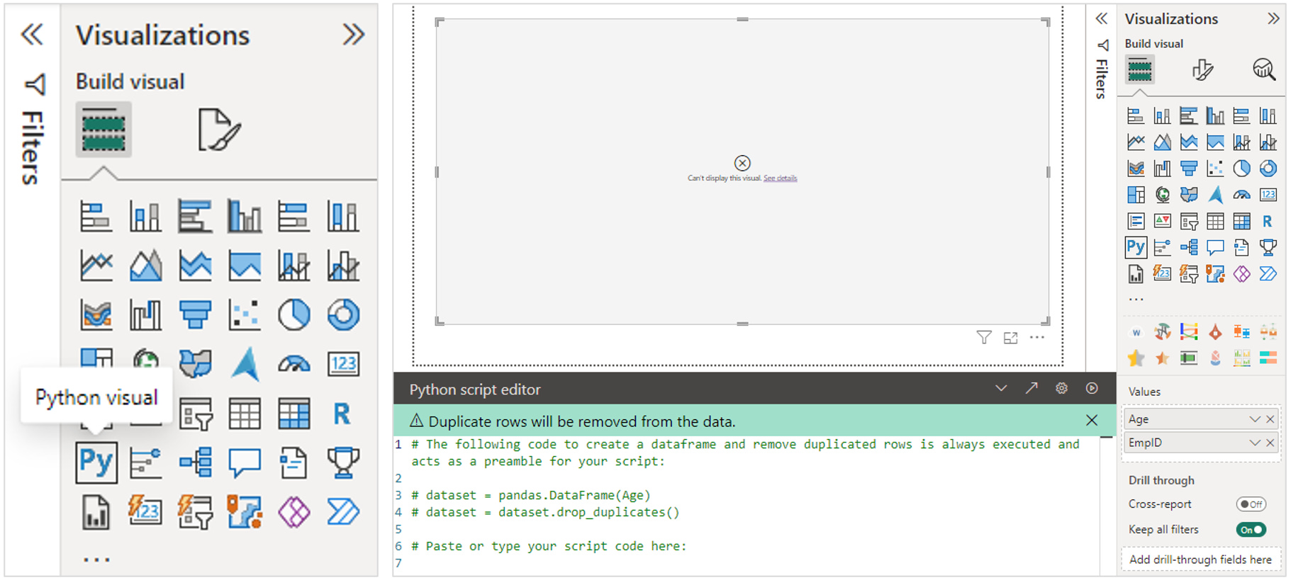
Step 2: Write Python script
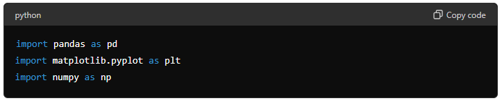
Importing Libraries: This example uses the pandas, matplotlib and numpy libraries.
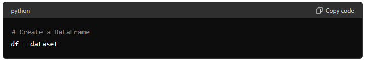
Creating a DataFrame: This line assigns the dataset imported by Power BI into a pandas DataFrame named df.
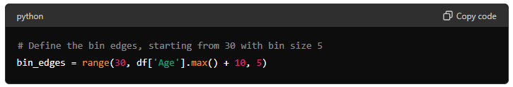
Define bins edge: creates a range of numbers starting at 30 and ending at the maximum age in the DataFrame plus 10, with a step size of 5. This will be used to define the bin edges for the histogram.
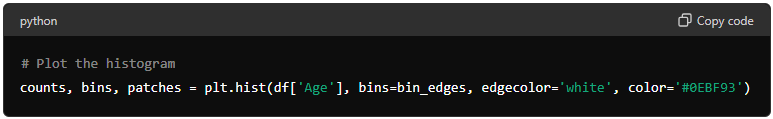
Plotting the Histogram: creates a histogram of the Age column in the DataFrame.
bins=bin_edges specifies the bin edges calculated earlier.
edgecolor='white' sets the color of the edges of the bars to white.
color='#0EBF93' sets the fill color of the bars to a specific green color.
The function returns three values:
counts: The number of entries in each bin.bins: The edges of the bins.patches: The individual patches used to create the histogram.
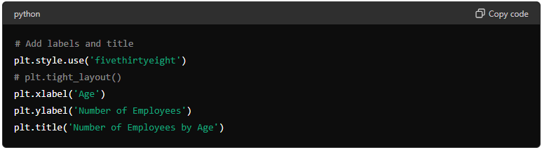
Adding Labels and Title
plt.style.use('fivethirtyeight') applies the 'fivethirtyeight' style to the plot, which is a predefined style in matplotlib that gives the plot a specific aesthetic.
plt.xlabel('Age') sets the label for the x-axis to "Age".
plt.ylabel('Number of Employees') sets the label for the y-axis to "Number of Employees".
plt.title('Number of Employees by Age') sets the title of the plot to "Number of Employees by Age".
plt.tight_layout() is commented out in this code. If uncommented, it would adjust the spacing between the plot elements to prevent overlap. This can be useful for ensuring that labels and titles do not overlap with the plot elements.
Setting X-Ticks: sets the ticks on the x-axis to the values defined in bin_edges, ensuring all bin edge values are shown on the x-axis.
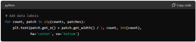
Adding Data Labels: This loop adds data labels to each bar in the histogram.
for count, patch in zip(counts, patches): iterates over each bin's count and the corresponding patch (bar).
patch.get_x() + patch.get_width() / 2: calculates the x-coordinate for the center of the bar.
plt.text(...): adds text at the calculated position.
patch.get_x() + patch.get_width() / 2: is the x-coordinate.
count: is the y-coordinate.
int(count): is the text to be displayed, converted to an integer.
ha='center': horizontally aligns the text to the center.
va='bottom': vertically aligns the text to the bottom.
Displaying the Plot in the output cell. This is essential for rendering the plot when running the script.
#FULL CODE BLOCK

import pandas as pd
import matplotlib.pyplot as plt
import numpy as np

# Create a DataFrame
df = dataset

# Define the bin edges, starting from 30 with bin size 5
bin_edges = range(30, df['Age'].max() + 10, 5)

# Plot the histogram
counts, bins, patches = plt.hist(df['Age'], bins=bin_edges, edgecolor='white', color='#0EBF93')

# Add labels and title
plt.style.use('fivethirtyeight')
plt.xlabel('Age')
plt.ylabel('Number of Employees')
plt.title('Number of Employees by Age')

# Set x-ticks to show all ages
plt.xticks(bin_edges)

# Add data labels
for count, patch in zip(counts, patches):
    plt.text(patch.get_x() + patch.get_width() / 2, count, int(count),
             ha='center', va='bottom')

# Display the plot
plt.show()
Step 3: Click play ▶️ icon
Feel free to adjust the code. For example you can add %Total and Median Vertical Line for better references.