
Building Page Navigation in Power BI

Navigating a Power BI dashboard should be as smooth and intuitive as browsing your favorite app. In today’s fast-paced, data-driven environment, it’s crucial to not only present data but also make it easy to explore.
Whether you're a seasoned Power BI user or just starting out, mastering page navigation can make a huge difference. Effective navigation means users can effortlessly switch between high-level summaries and detailed data insights. In this guide, we'll walk you through the steps to build seamless and user-friendly page navigation in Power BI.
Let's dive in and transform your Power BI dashboards into interactive, easy-to-navigate tools that everyone will love!
What we want to achieve

So here is what we want to achieve in the end: a clear, intuitive, and efficient Human Resource dashboard structured using the DAR methodology. In my opinion, DAR is one of excellent approaches for dashboard design. By organizing your dashboard into three distinct sections—Dashboard, Analysis, and Report—you ensure that users can easily navigate from high-level overviews to detailed data insights.
The Dashboard section provides a quick snapshot of key metrics, allowing users to identify trends at a glance.
The Analysis section offers deeper insights, breaking down data from various angles and dimensions to uncover underlying patterns.
Finally, the Report section gives access to detailed tables and raw data, supporting comprehensive reporting and precise data extraction.
This structured methodology not only enhances clarity and focus but also streamlines the user experience, making it easier to derive meaningful insights from your data.
For those unfamiliar with the DAR methodology, it is discussed in the book "On Business Intelligence with Qlik Sense". You can explore this concept further by referring to below source for a detailed understanding.
Qlik Design Blog - DAR: https://community.qlik.com/cyjdu72974/attachments/cyjdu72974/qlik-design-blog/2580/1/Technical%20Paper%20-%20DAR%20-%20US%20LETTER.pdf
Best Practice for Dashboard Design: https://www.ackinas.com/dar-principle
Step by Step Guidance
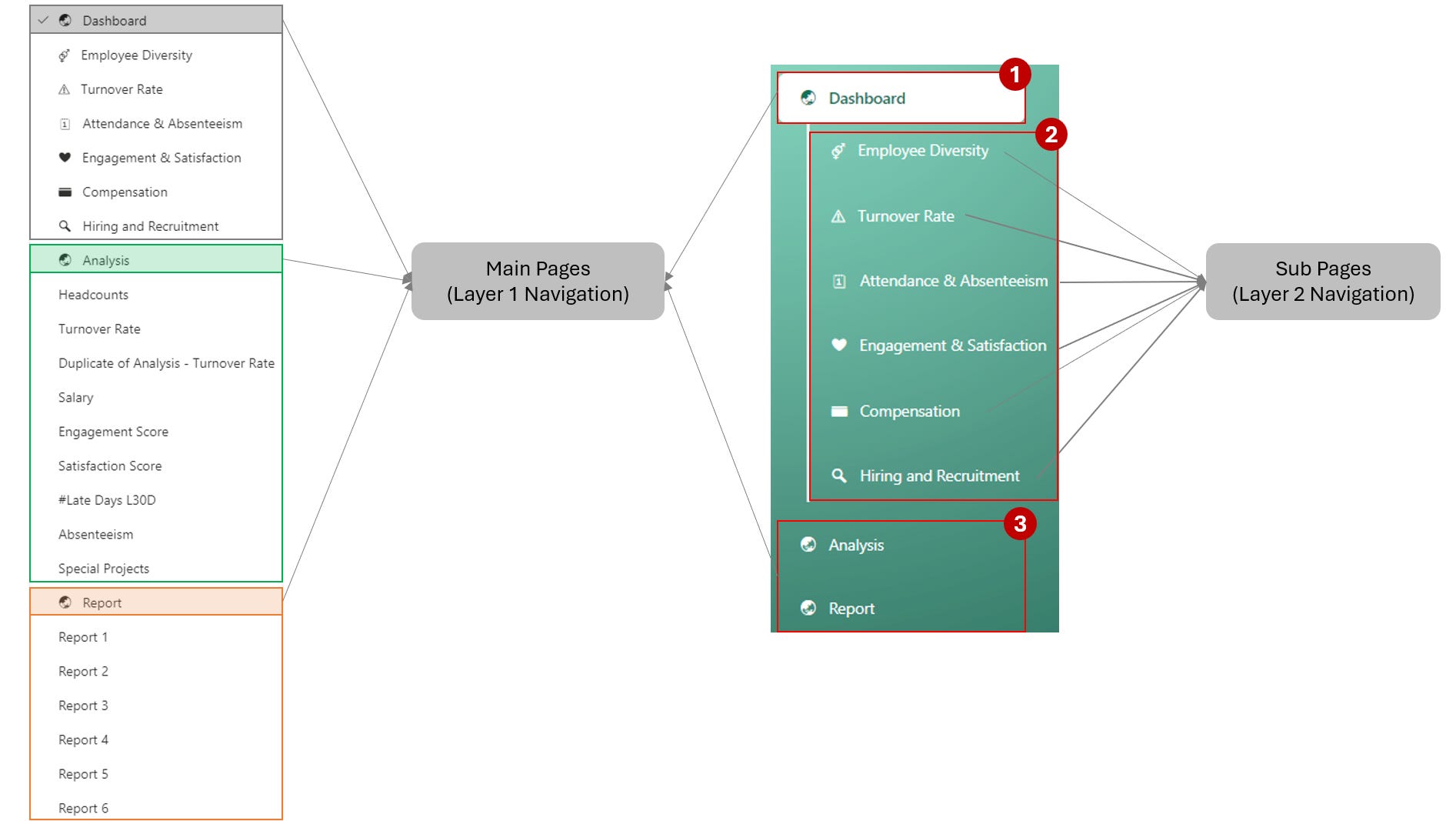
Step 1: Define main pages and sub pages
These are the main pages that end users will interact with, serving as the starting point for their data exploration.
Tip: Arrange all dashboard pages in order beforehand for easier management. For example:
Step 2: Create Page Navigator List
Insert > Button > Navigator > Page Navigator
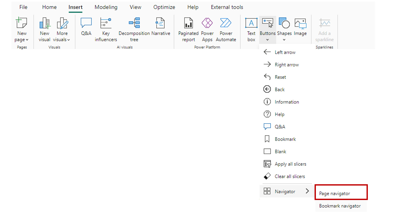
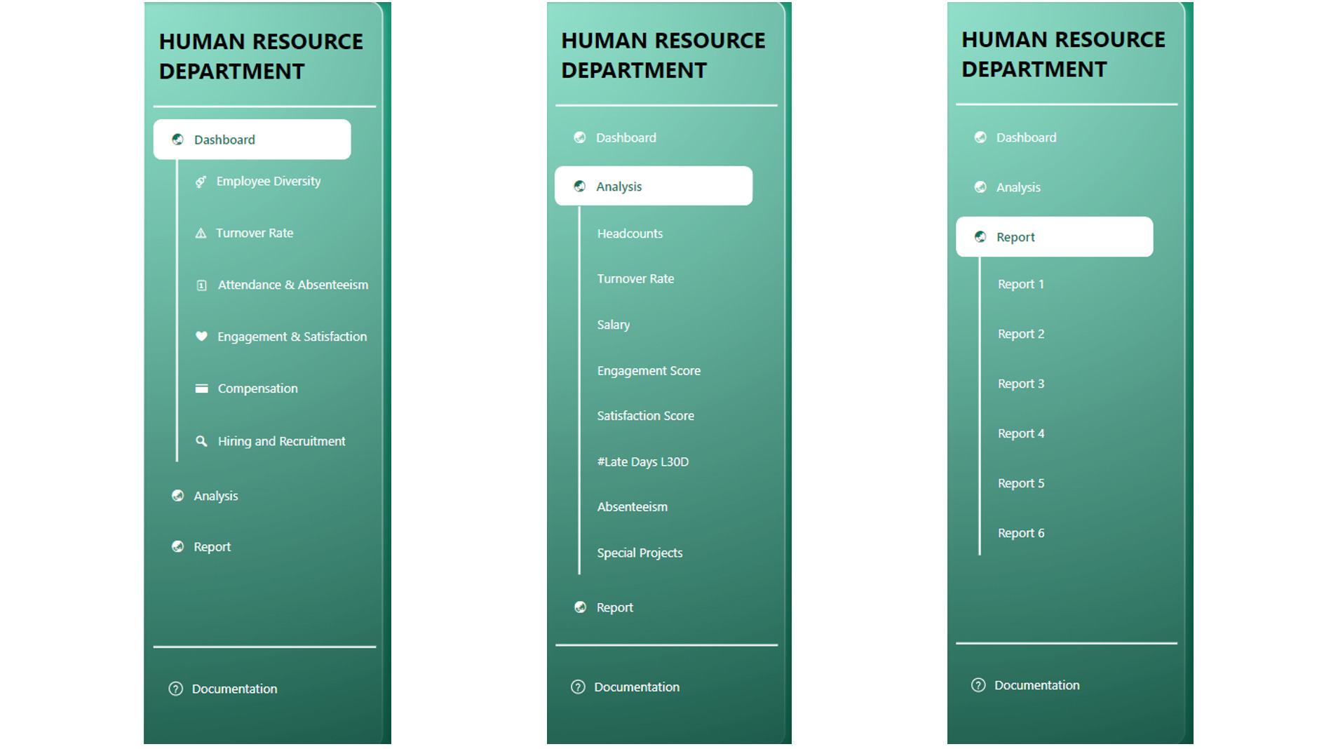
According to the design I want, I have to create 3 navigation list for 1st main page - “Dashboard” as below.
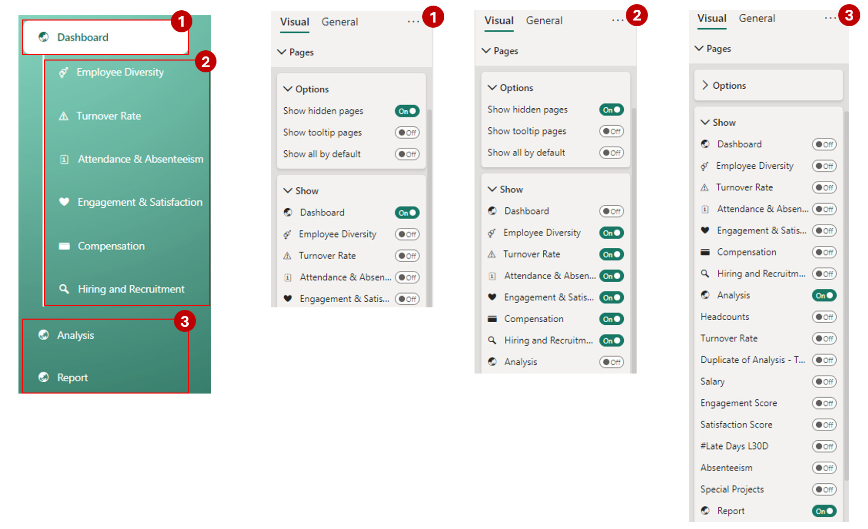
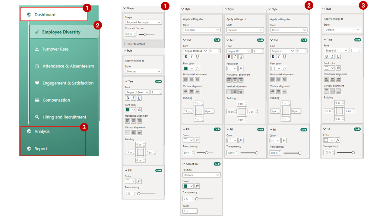
Step 3: Design the Navigator
When setting up page navigation in Power BI, you have several visual settings to customize the look and functionality of your navigation elements. Here’s an explanation of each:
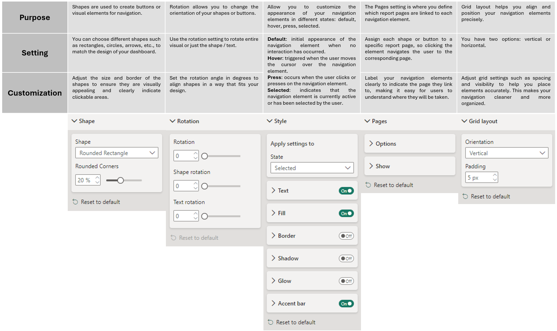
There are tons of ways to design a navigation panel, and it really comes down to your creativity. Just get familiar with the settings, and you'll be amazed at how many cool ideas you'll come up with.
In this example, my settings are as below:
Step 4: Repeat 3rd step with other main pages
In the end, this is how our navigation looks across the three main pages.
For anyone wondering how I created the dashboard background: I designed it in PowerPoint and then exported it as a Scalable Vector Graphics (SVG) file. After that, I simply replaced the dashboard background with the exported image.
And that wraps up our guide on setting up page navigation in Power BI using the DAR methodology. By organizing your dashboard into distinct sections—Dashboard, Analysis, and Report—you’ll make it easier for users to navigate and interact with your data. Remember, the key to a successful dashboard is not just in the data you present but in how intuitively your users can access and explore that data. With a clear understanding of visual settings, including the different states and customization options, you can create a seamless and engaging user experience. Thanks for reading, and happy dashboard designing!